Android 4
4. User Interface

In an Android application, the user interface is built using View and ViewGroup objects. There are many types of views and view groups, each of which is a descendant of the View class.
When we look at the documentation, the View class is declared as:
View
extend Object
implements Drawable.Callback KeyEvent.Callback
		AccessibilityEventSource
And the ViewGroup is declared as:
ViewGroup
extends View
implements ViewManager ViewParent
View objects are the basic units of user interface expression on the Android platform. The View class serves as the base for subclasses called "widgets," which offer fully implemented UI objects, like text fields and buttons. The ViewGroup class serves as the base for subclasses called "layouts," which offer different kinds of layout architecture, like linear, tabular and relative.
A View object is a data structure whose properties store the layout parameters and content for a specific rectangular area of the screen. A View object handles its own measurement, layout, drawing, focus change, scrolling, and key/gesture interactions for the rectangular area of the screen in which it resides. As an object in the user interface, a View is also a point of interaction for the user and the receiver of the interaction events.
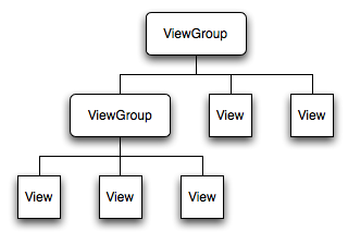
On the Android platform, we define an Activity's UI using a hierarchy of View and ViewGroup nodes, as shown in the diagram above. This hierarchy tree can be as simple or complex as we need it to be, and we can build it up using Android's set of predefined widgets and layouts, or with custom Views that we create.
In order to attach the view hierarchy tree to the screen for rendering, our Activity must call the setContentView() method and pass a reference to the root node object: to inflate within an Activity, usually within the onCreate() method, as setContentView() method accepts a resource identifier
    @Override
    public void onCreate(Bundle savedInstanceState) {
        super.onCreate(savedInstanceState);
        setContentView(R.layout.main);
    }
or as in the following example, to assign a user interface to an Activity, we can call setContentView() method from the onCreate() method of our Activity. In the example TextView is used as the Activity's user interface:
   @Override
   public void onCreate(Bundle savedInstanceState) {
       super.onCreate(savedInstanceState);
       TextView tv = new TextView(this);
       tv.setText("Hello, Android");
       setContentView(tv);
   }
Let's look at the code again. When we make an interactive Android program, we start by subclassing the Activity class. Activities provide the resuable, interchangeable parts of the flow of UI components across Android applications. When the system starts activity, it calls the constructor for HelloAndroidActivity, a subclass of Activity, and then calls its onCreate() method. This causes the view hierarchy described in the main.xml file to load and display. Actually, the onCreate() method kicks off the life cycle of the Activity.
package com.bogotobogo.layouts;

import android.app.Activity;
import android.os.Bundle;

public class LayoutsActivity extends Activity {
    /** Called when the activity is first created. */
    @Override
    public void onCreate(Bundle savedInstanceState) {
        super.onCreate(savedInstanceState);
        setContentView(R.layout.main);
    }
}
The Android system receives this reference and uses it to invalidate, measure, and draw the tree. The root node of the hierarchy requests that its child nodes draw themselves, in turn, each view group node is responsible for calling upon each of its own child views to draw themselves. The children may request a size and location within the parent, but the parent object has the final decision on where how big each child can be. Android parses the elements of our layout in-order (from the top of the hierarchy tree), instantiating the Views and adding them to their parent(s). Because these are drawn in-order, if there are elements that overlap positions, the last one to be drawn will lie on top of others previously drawn to that space.
While it is possible to create and attach widgets to our activity purely through Java code, the most common way to define our layout and express the view hierarchy is with an XML layout file. XML offers a human-readable structure for the layout, much like HTML. Each element in XML is either a View or ViewGroup object (or descendant thereof). View objects are leaves in the tree, ViewGroup objects are branches in the tree.
Dynamic instantiation of widgets, for example, using addView(View) method to insert new View or ViewGroup object, is reserved for more complicated scenarios, where the widgets are not known at compile time.
As the name indicates, an XML layout is a specification of widget's relationships to each other-and to their containers-encoded in XML format. Android considers XML layouts to be resources and layout files are stored in the res/layout directory inside Android project.
Android's SDK ships with a tool (aapt) that uses the layouts. The tool should be automatically invoked by Android toolchain (Eclipse or Ant's build.xml). The aapt generates the R.java source file within the project, allowing us to access layouts and widgets within those layouts directly from Java code.
Why use XML layouts?
The biggest reason, perhaps, is to assist in the creation of tools for view definition, such as a GUI builder in an IDE like Eclipse. Such GUI builders could generate Java code instead of XML. But the challenge is reading in the UI definition to support edits, which is far simpler when the data is in a structured format like XML rather than in a programming language. Moreover, keep generated definitions separated from Java code
can reduce the mistakes by the programmers.
What does it look like?
When we first create android project, the default layout looks like this:
<?xml version="1.0" encoding="utf-8"?>
<LinearLayout xmlns:android="http://schemas.android.com/apk/res/android"
    android:layout_width="fill_parent"
    android:layout_height="fill_parent"
    android:orientation="vertical" >

    <TextView
        android:layout_width="fill_parent"
        android:layout_height="wrap_content"
        android:text="@string/hello" />

</LinearLayout>
After we modify the layout (main.xml) a little bit as in the example below, a simple vertical layout with a text view and a button looks like this:
<?xml version="1.0" encoding="utf-8"?>
<LinearLayout xmlns:android="http://schemas.android.com/apk/res/android"
    android:layout_width="fill_parent"
    android:layout_height="fill_parent"
    android:orientation="vertical" >

    <TextView android:id="@+id/mytext"
        android:layout_width="fill_parent"
        android:layout_height="wrap_content"
        android:text="@string/mytext" />
    <Button android:id="@+id/mybutton"
            android:layout_width="wrap_content"
            android:layout_height="wrap_content"
            android:text="@string/mybutton" />

</LinearLayout>
We need to change the string.xml as well:
<?xml version="1.0" encoding="utf-8"?>
<resources>

    <string name="hello">Hello World, LayoutsActivity!</string>
    <string name="app_name">Layouts</string>
    <string name="mytext">Hello, I am a TextView</string>
    <string name="mybutton">Hello, I am a Button</string>

</resources>
The name of an XML element is respective to the Java class that it represents. So a <TextView> element creates a TextView, <Button> element creates a Button in our UI, and a <LinearLayout> element creates a LinearLayout view group. When we load a layout resource, the Android system initializes these run-time objects, corresponding to the elements in our layout.
Notice that the LinearLayout element contains both the TextView and the Button. We can nest another LinearLayout (or other type of view group) inside here, to lengthen the view hierarchy and create a more complex layout.
If we create our own widgets as subclasses of android.view.View, we will need to provide a full package declaration as well (e.g., com.bogotobogo.android.MyWidget).
The root element needs to declare the Android XML namespace:
xmlns:android="http://schemas.android.com/apk/res/android"
All other elements will be children of the root and will inherit that namespace declaration. Many widgets and containers need to appear only in the XML layout file and do not need to be referenced in our Java code. But anything we do want to use in our Java source, though, needs an android:id, in our case, Button and TextView.
The convention is to use @+id... as the id value, where ... represents our locally unique name for the widget in question.
Note that for each of the layout elements, the constants wrap_content and fill_parent are used rather than an exact height or width in pixels. These constants are the simplest, and most powerful, technique for ensuring our layouts are screen-size and resolution independent.
The wrap_content constant will set the size of a View to the minimum required to contain the contents it displays (such as the height required to display a wrapped text string). The fill_parent constant expands the View to fill the available space within the parent View (or screen).
Our layout is set to fill the entire screen, while both text-based Views are restricted to that required by the text being displayed.
Given that we have set up the widgets and containers in an XML layout file named main.xml in res/layout, all we need is one statement in our activity's onCreate() callback to use that layout:
setContentView(R.layout.main);
The Android-built view, constructed from our layout, is accessed from that code-generated R class. All of the layouts are accessible under R.layout, keyed by the base name of the layout file; for instance, res/layout.main.xml results in R.layout.main.
To access our identified widgets, use findViewById(), passing in the numeric identifier of the widget in question. That numeric identifier was generated by Android in the R class as R.id.button and R.id.text.
With a source code, "layout.java" below, we can run our application.
package com.bogotobogo.layouts;

import android.app.Activity;
import android.os.Bundle;
import android.view.View;
import android.widget.Button;
import android.widget.TextView;

public class LayoutsActivity extends Activity
	               implements View.OnClickListener{

    /** Called when the activity is first created. */
    @Override
    public void onCreate(Bundle savedInstanceState) {
        super.onCreate(savedInstanceState);
        setContentView(R.layout.main);

        Button btn =(Button)findViewById(R.id.mybutton);
        btn.setOnClickListener(this);
    }
    public void onClick(View view){
    	TextView tv =(TextView)findViewById(R.id.mytext);
    	tv.setText("button pressed");
    }
}
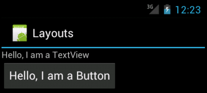
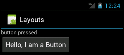
Here is a slightly modified version of "layout2.java" giving us the same results.
Java provides an anonymous class. The code below is similar to the previous one, except it is implemented using an anonymous class:
package com.bogotobogo.layouts;

import android.app.Activity;
import android.os.Bundle;
import android.view.View;
import android.widget.Button;
import android.widget.TextView;

public class LayoutsActivity extends Activity {
	protected void onCreate(Bundle icicle) {
		super.onCreate(icicle);
		setContentView(R.layout.main);
		final Button button = (Button) findViewById(R.id.mybutton);
		button.setOnClickListener(new View.OnClickListener() {
		    public void onClick(View v) {
		    	TextView tv =(TextView)findViewById(R.id.mytext);
		    	tv.setText("button pressed");
		    }
		});
	}
}
The code passes a newly created instance of View.OnClickListener as an argument in the call to button.setOnClickListener. In this example, however, the argument to the call to button.setOnClickListener is special syntax that defines a new subclass of the interface View.OnClickListener and instantiates it in a single statement. The new instance is an instance of a class that has no name: it is anonymous. Its definition exists only in the statement that instantiates it.
A widget is a View object that serves as an interface for interaction with the user. Android provides a set of fully implemented widgets, like buttons, checkboxes, and text-entry fields, so we can quickly build our UI. Some widgets provided by Android are more complex, like a date picker, a clock, and zoom controls. But we're not limited to the kinds of widgets provided by the Android platform. If we want to do something more customized and create our own actionable elements, we can, by defining our own View object or by extending and combining existing widgets.
The simplest widget is the label. Labels is a text that cannot be edited directly by users. Typically, they are used to identify adjacent widgets.
We can create a label by creating a TextView instance. Or we can create labels in XML layout files by adding a TextView element to the layout, with an android:text property to set the value of the label itself. If we need to swap labels based on certain criteria, such as internationalization, we may wish to use a resource reference in the XML instead.
TextView has numerous other properties of relevance for labels:
- android:typeface
Set the typeface to use for the label (e.g., monospace). - android:textStype
Indicates that the typeface should be made bold, italic, or bold. and italic. - android:textColor
Sets the color of the label's text, (e.g., #0000ff for blue).
Android 1.6 adds a new feature for the declaration of the "on-click" listener for a Button. In addition to the classic approach of defining some object (such as the activity) as implementing the View.OnClickListener interface, we cannot take a somewhat simpler approach:
- Define some method on our Activity that holds the button that takes a single View parameter, has a void return value, and is public.
- In layout XML, on the Buttton element, include the android:onClick attribute with the name of the method we defined in the previous step.
For example, we can modify the "layout.java" in Section. 4.1:
package com.bogotobogo.layouts;

import android.app.Activity;
import android.os.Bundle;
import android.view.View;
// import android.widget.Button;
import android.widget.TextView;


public class LayoutsActivity extends Activity {
	              // implements View.OnClickListener{

    /** Called when the activity is first created. */
    @Override
    public void onCreate(Bundle savedInstanceState) {
        super.onCreate(savedInstanceState);
        setContentView(R.layout.main);
    }
    public void myClick(View view){
    	TextView tv =(TextView)findViewById(R.id.mytext);
    	tv.setText("button pressed");
    }
}
We have a new method myClick() which was defined in main.xml and we do not have to implement View.OnClickListener in our Activity.
Here is the "main.xml" file with an additional method, android:onClick="myClick".
<?xml version="1.0" encoding="utf-8"?>
<LinearLayout xmlns:android="http://schemas.android.com/apk/res/android"
    android:layout_width="fill_parent"
    android:layout_height="fill_parent"
    android:orientation="vertical" >

    <TextView android:id="@+id/mytext"
        android:layout_width="fill_parent"
        android:layout_height="wrap_content"
        android:text="@string/mytext" />
    <Button android:id="@+id/mybutton"
            android:layout_width="wrap_content"
            android:layout_height="wrap_content"
            android:text="@string/mybutton"
	    android:onClick="myClick"/>
</LinearLayout>
The result of the run should be the same as in Section 4.1.
EditText is a subclass of TextView and EditText is a thin veneer over TextView that configures itself to be editable.
Along with the standard TextView properties, EditText has many other properties including:
- android:autoText
Controls if the field should provide automatic spelling assistance. - android:capitalize
Controls if the field should automatically capitalize the first letter of entered text. - android:digits
Configures the field to accept only certain digits. - android:singleLine
Controls if the field is for single-line input or multiple-line input.
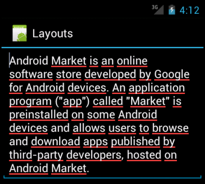
Let us look at the example:
package com.bogotobogo.layouts;

import android.app.Activity;
import android.os.Bundle;
import android.widget.EditText;


public class LayoutsActivity extends Activity {

    /** Called when the activity is first created. */
    @Override
    public void onCreate(Bundle savedInstanceState) {
        super.onCreate(savedInstanceState);
        setContentView(R.layout.main);
        EditText et = (EditText)findViewById(R.id.edtext);
        et.setText("Android Market is an online software store " +
        	"developed by Google for Android devices. " +
        	"An application program (\"app\") called \"Market\" " +
        	"is preinstalled on some Android devices and " +
        	"allows users to browse and download apps published " +
        	"by third-party developers, hosted on Android Market.");
    }
}
The main.xml should look like this:
<?xml version="1.0" encoding="utf-8"?>
<LinearLayout xmlns:android="http://schemas.android.com/apk/res/android"
    android:orientation="vertical"
    android:layout_width="fill_parent"
    android:layout_height="fill_parent">
    <EditText android:id="@+id/edtext"
       android:layout_width="fill_parent"
       android:layout_height="wrap_content"
       android:singleLine="false"/>
</LinearLayout>
java.lang.Object -> android.view.View -> android.widget.TextView -> android.widget.Button -> android.widget.CompoundButton -> android.widget.CheckBox.
A checkbox is a specific type of two-states button that can be either checked or unchecked. It has following properties:
- isChecked()
Determines if the check box has been checked. - setChecked()
Forces the check box into a checked or unchecked state. - toggle()
Toggles the check box as if the user checked it.
We can register a listener object (in this case, an instance of OnCheckedChangeListener) to be notified when the state of the check box changes.
Let us look at the example:
package com.bogotobogo.layouts;

import android.app.Activity;
import android.os.Bundle;
import android.widget.CheckBox;
import android.widget.CompoundButton;


public class LayoutsActivity extends Activity
	      implements CompoundButton.OnCheckedChangeListener {
	CheckBox cb;
    /** Called when the activity is first created. */
    @Override
    public void onCreate(Bundle savedInstanceState) {
        super.onCreate(savedInstanceState);
        setContentView(R.layout.main);

        cb = (CheckBox)findViewById(R.id.myCheckbox);
        cb.setOnCheckedChangeListener(this);
    }

    public void onCheckedChanged(CompoundButton buttonView,
    						boolean isChecked) {
    	if(isChecked){
    		cb.setText("state: checked");
    	}
    	else {
    		cb.setText("state: unchecked");
    	}
    }
}
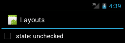
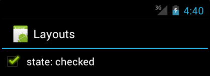
Note that the activity serves as its own listener for check box state changes, since it implements the OnCheckedChangeListener interface (via cb.setOnCheckedChangeListener(this)). The callback for the listener is onCheckedChanged(), which receives the check box whose state has changed. Then, we update the text of the check box to indicate what the actual box contains.
The layout file is:
<?xml version="1.0" encoding="utf-8"?>
<LinearLayout xmlns:android="http://schemas.android.com/apk/res/android"
    android:layout_width="fill_parent"
    android:layout_height="fill_parent"
    android:orientation="vertical" >

    <CheckBox android:id="@+id/myCheckbox"
    android:layout_width="fill_parent"
    android:layout_height="wrap_content" />
</LinearLayout>
Run this application and the result should look like this:
java.lang.Object -> android.view.View -> android.widget.TextView -> android.widget.Button -> android.widget.CompoundButton -> android.widget.RadioButton.
A radio button is a two-states button that can be either checked or unchecked. When the radio button is unchecked, the user can press or click it to check it. However, contrary to a CheckBox, a radio button cannot be unchecked by the user once checked.
Radio buttons are normally used together in a RadioGroup. When several radio buttons live inside a radio group, checking one radio button unchecks all the others.
There are other componets like ListView, Gallery, Spinner, ViewFlipper, and the more special-purpose AutoCompleteTextView, ImageSwitcher, QuickContactBadge, date-time pickers, auto-complete input boxes, maps, tab sheets, and TextSwitcher.
I will make examples for those components later. Here, I will just summarize the each component.
A view that shows items in a vertically scrolling list. The items come from the ListAdapter associated with this view.
A view that shows items in a center-locked, horizontally scrolling list. The default values for the Gallery assume we will be using Theme_galleryItemBackground as the background for each View given to the Gallery from the Adapter. If we are not doing this, we may need to adjust some Gallery properties, such as the spacing.
Views given to the Gallery should use Gallery.LayoutParams as their layout parameters type.
A view that displays one child at a time and lets the user pick among them. The items in the Spinner come from the Adapter associated with this view.
A View Group that lets us define a collection of Views as a horizontal row in which only one View is visible at a time, and in which transitions between visible views are animated.
An editable text view that shows completion suggestions automatically while the user is typing. The list of suggestions is displayed in a drop down menu from which the user can choose an item to replace the content of the edit box with.
The drop down can be dismissed at any time by pressing the back key or, if no item is selected in the drop down, by pressing the enter/dpad center key.
The list of suggestions is obtained from a data adapter and appears only after a given number of characters defined by the threshold.
Displays a badge showing the image icon assigned to a contact we specify using a phone number, name, e-mail address, or URI. Clicking the image will display the quick contact bar, which provides shortcuts for contacting the selected contact - including calling, sending an SMS, e-mail, and IM.
Specialized ViewSwitcher that contains only children of type TextView. A TextSwitcher is useful to animate a label on screen. Whenever setText(CharSequence) is called, TextSwitcher animates the current text out and animates the new text in.
Once we've added some Views/widgets to the UI, we probably want to know about the user's interaction with them, so we can perform actions. To be informed of UI events, we need to do one of two things:
- Define an event listener and register it with the View.
More often than not, this is how we'll listen for events. The View class contains a collection of nested interfaces named OnListener, each with a callback method called On ().
For example,
- View.OnClickListener
for handling "clicks" on a View. - View.OnTouchListener
for handling touch screen events in a View. - View.OnKeyListener
for handling device key presses within a View.
- View.OnClickListener
- Override an existing callback method for the View.
This is what we should do when we've implemented our own View class and want to listen for specific events that occur within it. Example events we can handle include:
- onTouchEvent()
Called when the touchscreen is pressed or released, or when it detects movement. - onTrackballEvent()
Called when the device's trackball is moved. - onKeyDown()
Called when any device key is pressed; includes the D-pad, keyboard, hang-up, call, back, and camera buttons. - onKeyUp()
Called when a user releases a pressed key.
- onTouchEvent()
Menus offer a way to expose application functions without sacrificing valuable screen space. Each Activity can specify its own menu that's displayed when the device's menu button is pressed.
Application menus are another important part of an application's UI. Menus offer a reliable interface that reveals application functions and settings. The most common application menu is revealed by pressing the MENU key on the device. However, we can also add Context Menus, which may be revealed when the user presses and holds down on an item.
Menus are also structured using a View hierarchy, but we don't define this structure. Instead, we define the onCreateOptionsMenu() or onCreateContextMenu() callback methods for our Activity and declare the items that we want to include in our menu. At the appropriate time, Android will automatically create the necessary View hierarchy for the menu and draw each of our menu items in it.
Menus also handle their own events, so there's no need to register event listeners on the items in our menu. When an item in our menu is selected, the onOptionsItemSelected() or onContextItemSelected() method will be called by the framework.
And just like our application layout, we have the option to declare the items for we menu in an XML file.
Ph.D. / Golden Gate Ave, San Francisco / Seoul National Univ / Carnegie Mellon / UC Berkeley / DevOps / Deep Learning / Visualization