Android 4
5. Layouts

This chapter
Layouts are extensions of the ViewGroup class used to position child controls for UI. Layouts can be nested, letting us create arbitrarily complicated interfaces using a combination of layouts.
Android SDK includes some simple layouts to help us construct our UI. It's up to us to select the right combination of layouts to make our interface easy to understand and use.
The following includes some of the more versatile layout classes available.
- FrameLayout
The simplest of the layout, the Frame Layout simply pins each child view to the top left corner. Adding multiple children stacks each new child on top of the one before, with each new View obscuring the last. - LinearLayout
A Linear Layout aligns each child View in either a vertical or a horizontal line. A vertical layout has a column of Views, while a horizontal layout has a row of Views. The Linear Layout enables us to specify a "widget" for each child View that controls the relative size of each within the available space. - RelativeLayout
The most flexible of the native layouts, the Relative Layout lets us define the positions of each child View relative to the others and to the screen boundaries. - TableLayout
The Table Layout lets us lay out Views using a grid of rows and columns. Tables can span multiple rows and columns, and columns can be set to shrink or grow. - Gallery
A Gallery Layout displays a single row of items in a horizontally scrolling list.
Linear layout is a box model, in which widgets or child layouts are lined up in a column or row, one after the next. Getting the visual representation we want is mostly a matter of identifying where boxes should nest and which properties those boxes should have, such as their alignment in relation to other boxes.
To configure a LinearLayout, we have five main areas of control:
- Orientation
Orientation indicates whether the LinearLayout represents a row or a column. Just add the android:orientation property to our LinearLayout element in XML layout, setting the value to be horizontal for a row or vertical for a column.
The orientation can be modified at runtime by invoking setOrientation() on the LinearLayout, supplying it either HORIZONTAL or VERTICAL. - Fill Model
Let us imagine a row of widgets, such as a pair of radio buttons. These widgets have a natural size based on their text. Their combined size probably do not exactly match the width of the Android device's screen, particularly since screens come in various sizes. We then have the issue of what to do with the remaining space.
All widgets inside a LinearLayout must supply android:layout_width and android:layout_height properties to help address this issue. These properties' values have three flavors:
- We can provide a specific dimension to indicate the widget would take up.
- We can provide wrap_content, which means the widget should fill up its natural space, unless that is too big, in which case Android can use word=wrap as needed to make it fit.
- We can provide fill_parent, which means the widget should fill up all available space in its enclosing container, after all other widgets are handled.
- Weight
But what happens if we have two widgets that should split the available free space? Foe example, suppose we have two multiline fields in a column, and we want them to take up the remaining space in the column after all other widgets have been allocated their space. To make this work, in addition to setting android:layout_width or android:layout_height to fill_parent, we must also set android:layout_weight.
The android:layout_weight property indicates the proportion of the free space that should go to that widget. For example, if we set android:layout_weight to be the same nonzero value of a pair of widgets(e.g., 1), the free space will be split evenly between them. If we set it to be 1 for one widget and 2 for the other widget, the second widget will use up twice the free space that the first widget does. The weight for a widget is zero by default.
Another pattern for using weights is if we want to allocate sizes on a percentage basis. To use this for a horizontal layout:- Set all the android:layout_width values to be 0 for the widget in the layout.
- Set the android:layout_weight values to be the desired percentage size for each widget in the layout.
- Make sure all those weights add up to 100.
- Gravity
By default, everything in a LinearLayout is left- and top- aligned. So, if we create a row of widgets via a horizontal LinearLayout, the row will start flush on the left side of the screen. If that's not what we want, we need to specify a gravity value. Using android:layout_gravity on a widget (or calling setGravity() at runtime on the widget's Java object), we can tell the widget and its container how to align it in on the screen.
For a column of widgets, common gravity values are left, center_horizontal, and right, center etc.
For a row of widgets, the default is for them to be aligned so their text is aligned on the baseline. We can specify a gravity of center_vertical to center the widgets along the row's vertical midpoint. - Padding
By default, widgets are tightly packed next to each other. If we want to increase the whitespace between widgets, we will want to use the android:layout_padding property (or call setPaddingh() at runtime on the widget's Java object). The padding specifies how much space there is between the boundaries of the widget's cell and the actual widget contents.
Let us run the following examples.
With the XML layout as below:
<?xml version="1.0" encoding="utf-8"?>
<LinearLayout xmlns:android="http://schemas.android.com/apk/res/android"
    android:orientation="vertical"
    android:layout_width="fill_parent"
    android:layout_height="fill_parent">
	<RadioGroup android:id="@+id/orientation"
		android:orientation="horizontal"
		android:layout_width="wrap_content"
		android:layout_height="wrap_content"
		android:padding="50dp">
		<RadioButton
			android:id="@+id/horizontal"
			android:text="@string/horizontal" />
		<RadioButton
			android:id="@+id/vertical"
			android:text="@string/vertical" />
	</RadioGroup>
	<RadioGroup android:id="@+id/gravity"
		android:orientation="vertical"
		android:layout_width="fill_parent"
		android:layout_height="wrap_content"
		android:padding="50dp">
		<RadioButton
			android:id="@+id/left"
			android:text="@string/left" />
		<RadioButton
			android:id="@+id/center"
			android:text="@string/center" />
		<RadioButton
			android:id="@+id/right"
			android:text="@string/right" />
	</RadioGroup>
</LinearLayout>
The strings.xml file should look like this:
<?xml version="1.0" encoding="utf-8"?>
<resources>

    <string name="app_name">LinearLayouts</string>
    <string name="horizontal">Horizontal</string>
    <string name="vertical">Vertical</string>
    <string name="left">Left</string>
    <string name="center">Center</string>
    <string name="right">Right</string>

</resources>
We get the result as in the picture below.
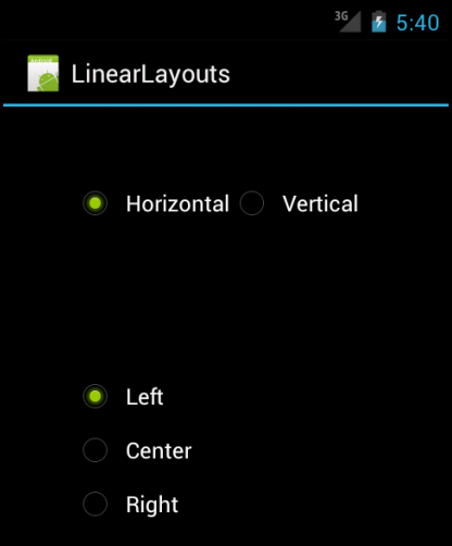
Note that we have a LinearLayout wrapping two RadioGroup sets. RadioGroup is a subclass of LinearLayout, so our example demonstrates nested boxes as if they were all LinearLayout containers.
The top RadioGroup sets up a row (android:orientation = "horizontal") of RadioButton widgets. The RadioGroup has 50px of padding on all sides, separating it from the other RadioGroup. The width and height are both set to wrap_content, so the radio buttons on the top will take up only the space that they need.
The bottom RadioGroup is a column (android:orientatikon = "vertical") of three RadioButton widgets. We have 50px of padding on all sides and a natural height (android:layout_height = "wrap_content"_/ However, we have set "android:layout_width" to be fill_parent, meaning the column of radio buttons claims the entire width of the screen.
To adjust these setting at runtime based on user input, we need help from Java code:
package com.bogotobogo.LinearLayouts;

import android.app.Activity;
import android.os.Bundle;
import android.view.Gravity;
import android.widget.LinearLayout;
import android.widget.RadioGroup;

public class LinearLayoutsActivity extends Activity
	implements RadioGroup.OnCheckedChangeListener {
		RadioGroup orientation;
		RadioGroup gravity;

		@Override
		public void onCreate(Bundle icicle) {
			super.onCreate(icicle);
			setContentView(R.layout.main);

			orientation=(RadioGroup)findViewById(R.id.orientation);
			orientation.setOnCheckedChangeListener(this);
			gravity=(RadioGroup)findViewById(R.id.gravity);
			gravity.setOnCheckedChangeListener(this);
		}

		public void onCheckedChanged(RadioGroup group, int checkedId) {
			switch (checkedId) {
				case R.id.horizontal:
					orientation.setOrientation(LinearLayout.HORIZONTAL);
					break;

				case R.id.vertical:
					orientation.setOrientation(LinearLayout.VERTICAL);
					break;

				case R.id.left:
					gravity.setGravity(Gravity.LEFT);
					break;

				case R.id.center:
					gravity.setGravity(Gravity.CENTER_HORIZONTAL);
					break;

				case R.id.right:
					gravity.setGravity(Gravity.RIGHT);
					break;
			}
		}
	}
In onCreate(), we look up our two RadioGroup layouts and register a listener on each, so we are notified when the radio buttons change state (
In onCheckedChanged() (the callback for the listener), we see which RadioGroup had a state change. If it was orientation group, we adjust the orientation based on the user's selection. Same to gravity group.
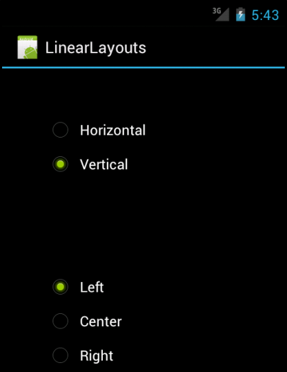
If we toggle on the vertical radio button, the top RadioGroup adjust to match, as shown in the picture below.
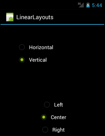
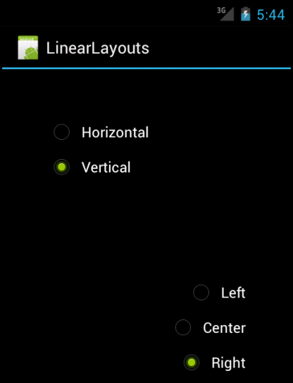
If we toggle the center or right radio button, the bottom RadioGroup adjust to match as shown in the pictures below.
A dimension is specified with a number followed by a unit of measure.
http://developer.android.com/guide/topics/resources/more-resources.html#Dimension
- dp Density-independent Pixels - an abstract unit that is based on the physical density of the screen. These units are relative to a 160 dpi (dots per inch) screen, so 160dp is always one inch regardless of the screen density. The ratio of dp-to-pixel will change with the screen density, but not necessarily in direct proportion. You should use these units when specifying view dimensions in your layout, so the UI properly scales to render at the same actual size on different screens. (The compiler accepts both "dip" and "dp", though "dp" is more consistent with "sp".)
- sp Scale-independent Pixels - this is like the dp unit, but it is also scaled by the user's font size preference. It is recommend you use this unit when specifying font sizes, so they will be adjusted for both the screen density and the user's preference.
- pt Points - 1/72 of an inch based on the physical size of the screen.
- px Pixels - corresponds to actual pixels on the screen. This unit of measure is not recommended because the actual representation can vary across devices; each devices may have a different number of pixels per inch and may have more or fewer total pixels available on the screen.
- mm Millimeters - based on the physical size of the screen.
- in Inches - based on the physical size of the screen.
RelativeLayout is a Layout where the positions of the children can be described in relation to each other or to the parent.
Note that we cannot have a circular dependency between the size of the RelativeLayout and the position of its children. For example, we cannot have a RelativeLayout whose height is set to WRAP_CONTENT and a child set to ALIGN_PARENT_BOTTOM.
To make our RelativeLayout work, we need ways to reference other widgets within an XML layout file, plus to indicate the relative position of those widgets.
Positions Relative to Container:
- android:layout_alignParentTop
Aligns the widget's top with the top of the container. - android:layout_alignParentBottom
Aligns the widget's bottom with the bottom of the container. - android:layout_alignParentLeft
Aligns the widget's left side with the left side of the container. - android:layout_alignParentRight
Aligns the widget's right side with the right side of the container. - android:layout_centerParentHorizontal
Positions the widget horizontally at the center of the container. - android:layout_centerParentVertical
Positions the widget's vertically at the center of the container. - android:layout_centerInParent
Positions the widget both horizontally and vertically at the center of the container.
All of these properties take a simple Boolean value.
Let us try an example with a label, input field, and a pair of buttons labeled OK and Cancel.
<?xml version="1.0" encoding="utf-8"?>
<RelativeLayout
	xmlns:android="http://schemas.android.com/apk/res/android"
	android:layout_width="fill_parent"
	android:layout_height="wrap_content"
	android:padding="5dp">
	<TextView android:id="@+id/label"
		android:layout_width="wrap_content"
		android:layout_height="wrap_content"
		android:text="@string/label"/>
	<EditText
		android:id="@+id/entry"
		android:layout_width="fill_parent"
		android:layout_height="wrap_content"
		android:layout_toRightOf="@id/label"
		android:layout_alignBaseline="@id/label"
		android:inputType="textUri"/>
	<Button
		android:id="@+id/ok"
		android:layout_width="wrap_content"
		android:layout_height="wrap_content"
		android:layout_below="@id/entry"
		android:layout_alignRight="@id/entry"
		android:text="@string/ok" />
	<Button
		android:id="@+id/cancel"
		android:layout_width="wrap_content"
		android:layout_height="wrap_content"
		android:layout_toLeftOf="@id/ok"
		android:layout_alignTop="@id/ok"
		android:text="@string/cancel" />
</RelativeLayout>
and strings.xml:
<?xml version="1.0" encoding="utf-8"?>
<resources>

    <string name="hello">Hello World, RelativeLayoutsActivity!</string>
    <string name="app_name">RelativeLayouts</string>
    <string name="label">URL:</string>
    <string name="ok">OK</string>
    <string name="cancel">Cancel</string>

</resources>
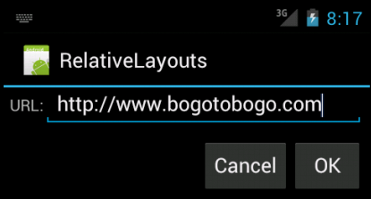
First, we open the RelativeLayout. In this case, we want to use the full width of the screen (android:layout_width = "fill_parent"), only as much height as we need (android:layout_height = "wrap_content"), and have 5 dp of padding between the boundaries of the container and its components (android:padding = "5dp").
Then, we add in the field. We want the field to be the right of the label and have the text aligned along the baseline. Also, the field should take up the rest of this row in the layout. These requirements are handled by three properties:
- android:layout_toRightOf = "@id/label"
- android:layout_alignBaseline = "@id/label"
- android:layout_width = "fill_parent"
A layout that arranges its children into rows and columns. A TableLayout consists of a number of TableRow objects, each defining a row (actually, we can have other children, which will be explained below). TableLayout containers do not display border lines for their rows, columns, or cells. Each row has zero or more cells; each cell can hold one View object. The table has as many columns as the row with the most cells. A table can leave cells empty. Cells can span columns, as they can in HTML.
Please check simple app using TableLayout with TableRow: Mortgage Calculator.
The width of a column is defined by the row with the widest cell in that column. However, a TableLayout can specify certain columns as shrinkable or stretchable by calling setColumnShrinkable() or setColumnStretchable(). If marked as shrinkable, the column width can be shrunk to fit the table into its parent object. If marked as stretchable, it can expand in width to fit any extra space. The total width of the table is defined by its parent container. It is important to remember that a column can be both shrinkable and stretchable. In such a situation, the column will change its size to always use up the available space, but never more. Finally, we can hide a column by calling setColumnCollapsed().
The children of a TableLayout cannot specify the layout_width attribute. Width is always MATCH_PARENT.
However, the layout_height attribute can be defined by a child; default value is WRAP_CONTENT. If the child is a TableRow, then the height is always WRAP_CONTENT.
Cells must be added to a row in increasing column order, both in code and XML. Column numbers are zero-based. If we don't specify a column number for a child cell, it will autoincrement to the next available column. If we skip a column number, it will be considered an empty cell in that row.
Although the typical child of a TableLayout is a TableRow, we can actually use any View subclass as a direct child of TableLayout. The View will be displayed as a single row that spans all the table columns.
Let us work with more specific cases.
Rows are declared by putting widgets as children of a TableRow inside the overall TableLayout. The number of columns is determined by Android; we control the number of columns in an indirect fashion. First, there will be at least one column per widget in our longest row. So if we have three rows-one with three widgets, and one with four widgets-there will be at least four columns. However, a widget can take up more than one column by including the android:layout_span property, indicating the number of columns the widget spans. Following layout fragment, the field spans three columns:
<TableRow>
	<TextView android:text="@string/url" />
	<EditText android:id="@+id/entry"
		android:layout_span="3"
		android:inputType="textUri"/>/>
</TableRow>
Normally, widgets are put into the first available column. In the preceding fragment, the label would go in the first column and the field would go into a spanned set of three columns (columns 1 through 3). However, we can put a widget into a different column via the android:layout_column property, specifying the 0-based column the widget belongs to:
<TableRow>
	<Button
		android:id="@+id/cancel"
		android:layout_column = "2"
		android:text="@string/cancel" />
	<Button android:id="@+id/ok"
                android:text="@string/cancel" />
</TableRow>
The cancel button goes in the third column. The OK button then goes into the next available column, which is the fourth column.
TableLayout contains only TableRow elements as immediate children. However, it is possible to put other widgets in between rows. For those widgets, TableLayout behaves a bit like LinearLayout with vertical orientation. The widgets automatically have their width set to fill_parent, so they will fill the same space that the longest row does.
Let us look at the example with layout file:
<?xml version="1.0" encoding="utf-8"?>
<TableLayout
	xmlns:android="http://schemas.android.com/apk/res/android"
	android:layout_width="fill_parent"
	android:layout_height="fill_parent"
	android:stretchColumns="1">
	<TableRow>
		<TextView android:text="@string/url" />
		<EditText android:id="@+id/entry"
			android:layout_span="3"
			android:inputType="textUri"/>/>
	</TableRow>
	<View android:layout_height="5dp"
		android:background="#0000FF" />
	<TableRow>
		<Button android:id="@+id/cancel"
			android:layout_column="0"
			android:text="@string/cancel" />
		<Button android:id="@+id/ok"
			android:layout_column="3"
			android:text="@string/ok" />
	</TableRow>
</TableLayout>
and strings.xml:
<?xml version="1.0" encoding="utf-8"?>
<resources>

    <string name="hello">Hello World, RelativeLayoutsActivity!</string>
    <string name="app_name">RelativeLayouts</string>
    <string name="url">URL:</string>
    <string name="ok">OK</string>
    <string name="cancel">Cancel</string>

</resources>
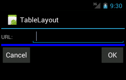
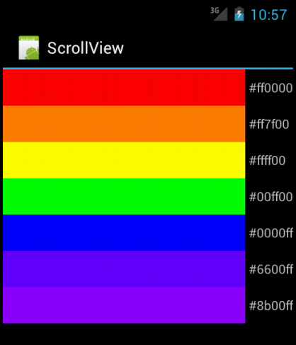
Layout container for a view hierarchy that can be scrolled by the user, allowing it to be larger than the physical display. A ScrollView is a FrameLayout, meaning we should place one child in it containing the entire contents to scroll; this child may itself be a layout manager with a complex hierarchy of objects. A child that is often used is a LinearLayout in a vertical orientation, presenting a vertical array of top-level items that the user can scroll through.
The TextView class also takes care of its own scrolling, so does not require a ScrollView, but using the two together is possible to achieve the effect of a text view within a larger container.ScrollView only supports vertical scrolling.
Let us look at the example layout file:
<?xml version="1.0" encoding="utf-8"?>
<ScrollView
	xmlns:android="http://schemas.android.com/apk/res/android"
	android:layout_width="fill_parent"
	android:layout_height="wrap_content">
	<TableLayout
		android:layout_width="fill_parent"
		android:layout_height="wrap_content"
		android:stretchColumns="0">
		<TableRow>
			<View
				android:layout_height="40dp"
				android:background="#ff0000"/>
			<TextView android:text="@string/cff0000"
				android:paddingLeft="4dp"
				android:layout_gravity="center_vertical" />
		</TableRow>
		<TableRow>
			<View
				android:layout_height="40dp"
				android:background="#ff7f00" />
			<TextView android:text="@string/cff7f00"
				android:paddingLeft="4dp"
				android:layout_gravity="center_vertical" />
		</TableRow>
		<TableRow>
			<View
				android:layout_height="40dp"
				android:background="#ffff00" />
			<TextView android:text="@string/cffff00"
				android:paddingLeft="4dp"
				android:layout_gravity="center_vertical" />
		</TableRow>
		<TableRow>
			<View
				android:layout_height="40dp"
				android:background="#00ff00" />
			<TextView android:text="@string/c00ff00"
				android:paddingLeft="4dp"
				android:layout_gravity="center_vertical" />
		</TableRow>
		<TableRow>
			<View
				android:layout_height="40dp"
				android:background="#0000ff" />
			<TextView android:text="@string/c0000ff"
				android:paddingLeft="4dp"
				android:layout_gravity="center_vertical" />
		</TableRow>
		<TableRow>
			<View
				android:layout_height="40dp"
				android:background="#6600ff" />
			<TextView android:text="@string/c6600ff"
				android:paddingLeft="4dp"
				android:layout_gravity="center_vertical" />
		</TableRow>
		<TableRow>
			<View
				android:layout_height="40dp"
				android:background="#8b00ff" />
			<TextView android:text="@string/c8b00ff"
				android:paddingLeft="4dp"
				android:layout_gravity="center_vertical" />
		</TableRow>
	</TableLayout>
</ScrollView>
and strings.xml:
<?xml version="1.0" encoding="utf-8"?>
<resources>

    <string name="hello">Hello World, ScrollViewActivity!</string>
    <string name="app_name">ScrollView</string>
    <string name="cff0000">#ff0000</string>
    <string name="cff7f00">#ff7f00</string>
    <string name="cffff00">#ffff00</string>
    <string name="c00ff00">#00ff00</string>
    <string name="c0000ff">#0000ff</string>
    <string name="c6600ff">#6600ff</string>
    <string name="c8b00ff">#8b00ff</string>

</resources>
Ph.D. / Golden Gate Ave, San Francisco / Seoul National Univ / Carnegie Mellon / UC Berkeley / DevOps / Deep Learning / Visualization