Android 4
2. My First Android Application
- Hello World: Part C

In this chapter:
- 2.0 Android Development Tools
- 2.1 Creating a New Project
- 2.2 Adding UI Elements
- 2.3 Creating Attributes
- 2.4 Coding
- 2.5 Connecting Methods to Buttons
- 2.6 Running Android Application
- 2.7 Adding It to the Menu
- 2.8 Testing on a Real Android Device (Phone/Tablet) - Part A (Using SD Card)
- 2.9 Testing on a Real Android Device (Phone/Tablet) - Part B (Using USB)
- 2.10 Using Relative Layout instead of main.xml's Linear Layout
In this section, we'll build another example of UI using ADT. We are not going to write a code nor deal with any xmls. In this section, We'll try our best to use every UI related feature that the ADT provides us.
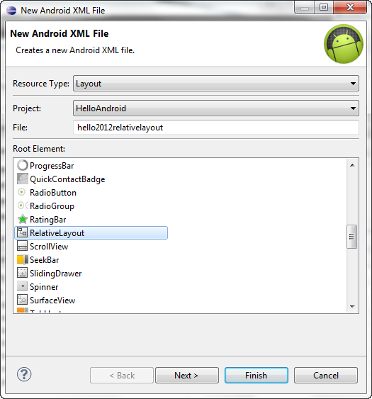
First, we want to delete the default layout (main.xml) which was made when we created the project. Then, we make a new one (relative layout not linear layout).
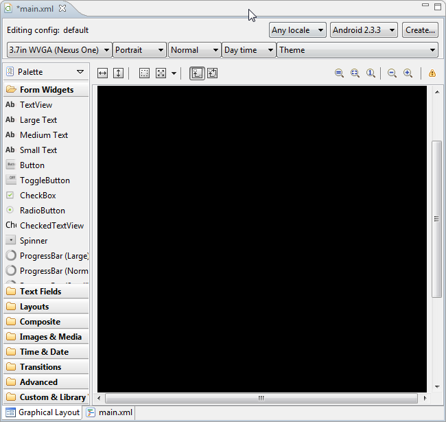
The picture below shows our new main.xml file in the Visual Layout Editor. We select 3.7in WVGA (Nexus One). In general, quite a few smartphones have resolution 480x800 or 480x854.
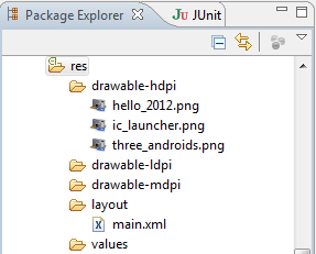
Anroid runs on a wide variety of devices with various screen sizes, resolutions, and dpi. So, Android allows us to provide separate images depending on the actual devices's pixel density. That's why we have three subfolders for the images under res folder.

Let's put the following two images into the res/drawable-hdpi folder by drag-and-drop.


To manipulate the layout programmatically, we should rename each layout. Each object's name is specified via its id, and it can be used to access and modify component. Let's open the Property window by double clicking the RelativeLayout in the OutLine window as shown below or Window>Show View>Other..., and then select Properties from the General in the Show View dialog.


The "+" in @+id/hello2012RelativeLayout tells
that a new variable should be created with the identifier name hello2012RelativeLayout. Note that the layout name has been changed;

We also want to change the background color from black which is default to white (#FFFFFF):

The background color change also can be done using Color resources with a color string as in the section 2.3 Creating Attributes. This is considered as a good practice since it's using externalized resource, and it allows us to separate resources from app's code. This also enhance scalability of localization.
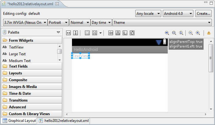
Now, it's time to add a TextView to UI. Drag TextView from the Form Widgets which is at the left of the Layout Editor.
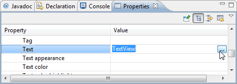
We open Resource Chooser dialog by clicking ellipsis button at the Text in the Properties window.
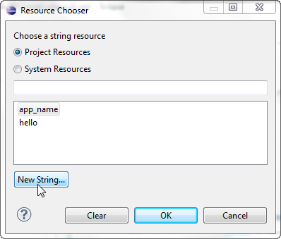
Click the New String....
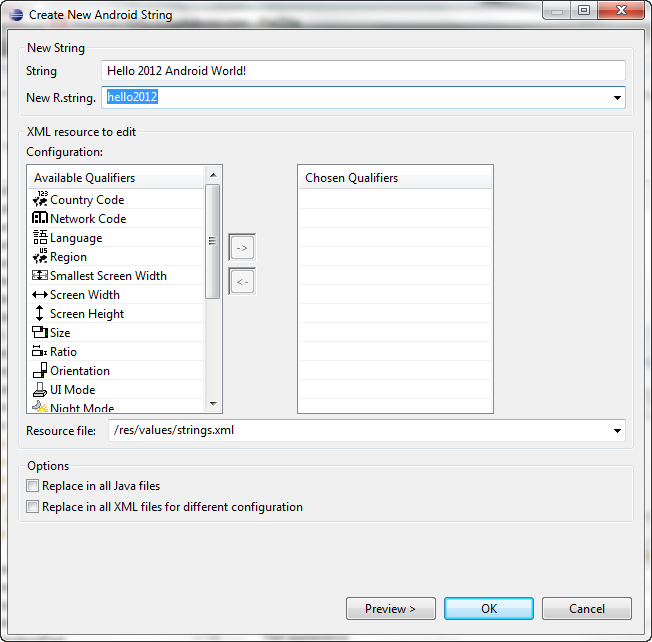
Type in the String and New R.String, and hit OK.
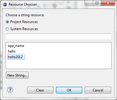
Click OK.
This is what we've got so far. In the Properties window, the @string means that an existing string resource will be selected from the strings.xml. The string name hello2012 indicates which string resources to select.
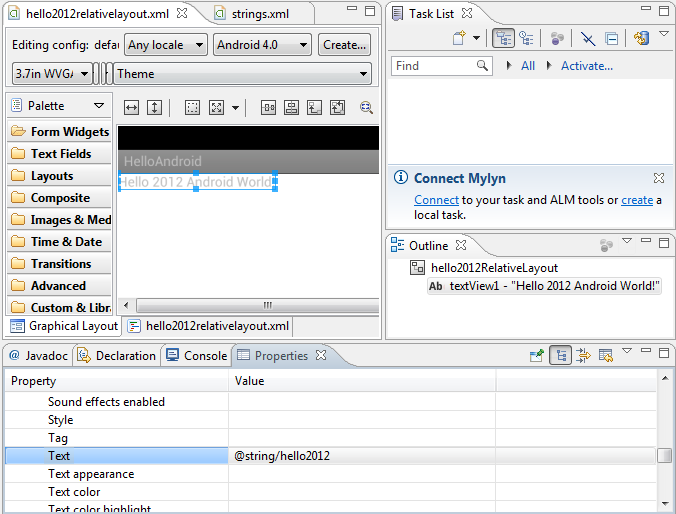
The main advantage of keeping string values in this way is that we can localize with ease by having additional XML resource files for string resources in other languages. In our project's res folder, the subfolder values contains a st rings.xml file that's used to store strings. To provide localized string for other languages, we can create separate values folder for each languages. For example, the folder values-kr would contain a strings.xml file for Korea. Android can choose the appropriate resource file based on the device user's preferred language.
By defining our UI with dip enables the Android to automatically scale the UI. One dip is equivalent to one pixel on a screen with 160 dpi (dots per inch). So, on a screen with 240 dpi, each dip will be scaled by a factor of 240/160 (= 1.5).
Now it's time to work on our text. We want to change the font size and will put some padding to the text.
In the Properties window,
- we set Text size = 35sp
- and Layout margin top = 15dp.
- Set the Text Id to @+id/hello2012TextView.
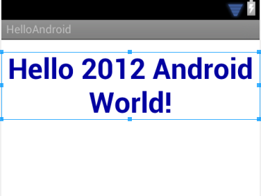
- Set the Text color to #0000A0 (Dark Blue).
- Set the Text style to bold.
- To place the text at the center when it wraps to multiple lines, we set its Gravity field to center.
This is what we get:
Now we are about to add images to the view.
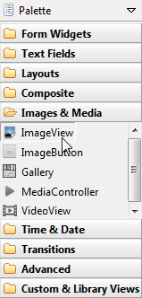
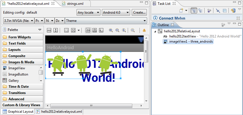
From the Images & Media category in the Layout Editor's Palette, drag an ImageView and drop it onto the Outline window.
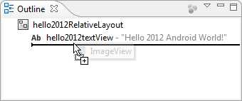
However, this does not mean that the image will be placed below the TextView. We need to set the Layout below property to put in below the TextView as we see in the picture below:
Actually, we can make this work by putting the ImageView directly on the hello2012textView, but we're going to do it in the following section:
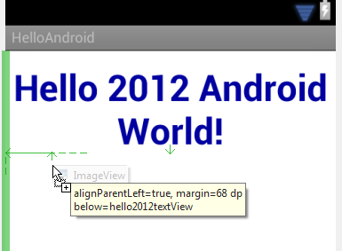
One of the advantages of using Outline window over using Layout Editor is that it's more convenient to place complicated UI components in the correct nested locations because Outline shows structure of the UI. One example might be the TableLayout with TableRow.
We want to set the property of the image we just put into the TextView.
- Set Id to @+id/imageThreeAndroids
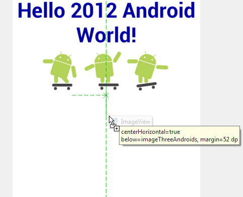
- Set imageThreeAndroids' Layout below property to @+id/hello2012textView to position the ImageView below the hello2012textView.
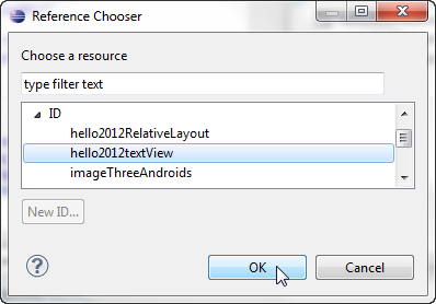
Then, we see the change in the Properties window.

- To position it horizontally center, set the Layout center horizontal to true
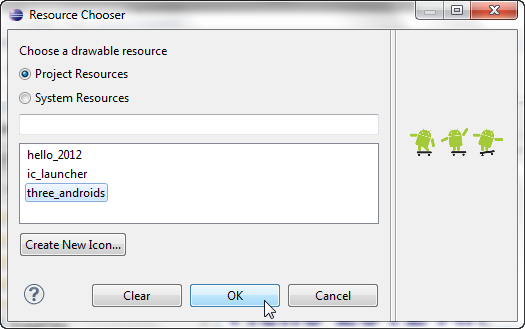
- Make sure the Src property to @drawable/three_androids
- We can do the same thing (#1-#4) for hello2012.png image. But we will directly put it below the imageThreeAndroids in the TextView.
- 2.0 Android Development Tools
- 2.1 Creating a New Project
- 2.2 Adding UI Elements
- 2.3 Creating Attributes
- 2.4 Coding
- 2.5 Connecting Methods to Buttons
- 2.6 Running Android Application
- 2.7 Adding It to the Menu
- 2.8 Testing on a Real Android Device (Phone/Tablet) - Part A (Using SD Card)
- 2.9 Testing on a Real Android Device (Phone/Tablet) - Part B (Using USB)
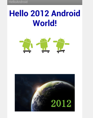
After adjusting the positions with mouse, here is the final result of the work.
Previous sections of this chapter 2:
Ph.D. / Golden Gate Ave, San Francisco / Seoul National Univ / Carnegie Mellon / UC Berkeley / DevOps / Deep Learning / Visualization