Java Graphics Interface II
Labels, Text Fields, Layouts - 2020

Let's look at the code and the result first:
import javax.swing.*;

class Labels extends JFrame
{
	JPanel panel = new JPanel();

	ClassLoader loader = this.getClass().getClassLoader();
	ImageIcon debussy = new ImageIcon( loader.getResource("Debussy.png") );
	ImageIcon ravel = new ImageIcon( loader.getResource("Ravel.png") );

	JLabel label1 = new JLabel( "Debussy", debussy, JLabel.CENTER ) ;
	JLabel label2 = new JLabel( "French Composers" ) ;
	JLabel label3 = new JLabel( "Ravel", ravel, JLabel.CENTER ) ;

	public Labels()
	{
		super("Composers - Impressionists");
		setSize( 400,200 );
		setDefaultCloseOperation( EXIT_ON_CLOSE );
		add(panel);

		label1.setHorizontalTextPosition(JLabel.CENTER);
		label1.setVerticalTextPosition(JLabel.TOP);
		label3.setHorizontalTextPosition(JLabel.CENTER);
		label3.setVerticalTextPosition(JLabel.BOTTOM);

		label1.setToolTipText( "Debussy - Bergamasque" ) ;
		label3.setToolTipText( "Ravel - Bolero" ) ;

		panel.add( label1 ) ;
		panel.add( label2 ) ;
		panel.add( label3 ) ;

		setVisible( true );
	}

	public static void main ( String[] args )
	{
		new Labels();
	}
}
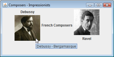
JLabel class creates a label component that can be added to a graphical interface. JLabel object is created with a new keyword and its constructor takes a String argument specifying text to be displayed on that label, or the name of an ImageIcon object representing an image to display. It can also take three arguments to specify text, image, and the horizontal alignment as a JLabel constant.
JLabel label1 = new JLabel( "Debussy", debussy, JLabel.CENTER ) ;
JLabel label2 = new JLabel( "French Composers" ) ;
JLabel label3 = new JLabel( "Ravel", ravel, JLabel.CENTER ) ;
When a JLabel object contains both text and an image, the relative position of the text can be determined by specifying a JLabel constant as the argument to setHorizontalPosition() method of the JLabel:
label1.setHorizontalTextPosition(JLabel.CENTER);
JLabel object also can be made to display a ToolTip when the cursor hovers over by specifying a text String as the argument to that object's setToolTipText() method:
label1.setToolTipText( "Debussy - Bergamasque" ) ;
The following two statements align the text centrally below the third label:
label3.setHorizontalTextPosition(JLabel.CENTER);
label3.setVerticalTextPosition(JLabel.BOTTOM);
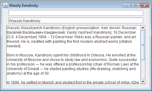
The JTextField class creates a single-line text field component. This can be used to display editable text and allows the user to enter text to interact with the program.
The JTextField object is created with the net keyword and its constructor can take a String argument for default text. In this case the component will be sized to accommodate the length of the String. Alternatively, the argument may be a numeric value to specify size of the text field. The constructor can take two arguments specifying both default text and the text field size.
import javax.swing.*;

class TextFields extends JFrame
{
	JPanel panel = new JPanel();

	JTextField txt1 = new JTextField( 40 ) ;
	JTextField txt2 = new JTextField( "Wassily Kandinsky", 40 ) ;

	JTextArea txtArea = new JTextArea( 12, 40 ) ;

	JScrollPane pane = new JScrollPane( txtArea ) ;

	public TextFields()
	{
		super( "Wassily Kandinsky" );
		setSize( 500,300 );
		setDefaultCloseOperation( EXIT_ON_CLOSE );
		add(panel);

		txtArea.setLineWrap( true ) ;
		txtArea.setWrapStyleWord( true ) ;

		pane.setVerticalScrollBarPolicy(JScrollPane.VERTICAL_SCROLLBAR_ALWAYS);

		panel.add( txt1 ) ;
		panel.add( txt2 ) ;
		panel.add( pane ) ;

		setVisible( true );
	}

	public static void main ( String[] args )
	{
		new TextFields();
	}
}
A multiple-line text field can be created with the JTextField class whose constructor takes two numerical arguments specifying its number of lines and its width. Three arguments can be given to specify default text, line number, and width. Text can be made to wrap at word endings within this field by specifying true as the argument to the setLineWrap() method and setWrapStyleWord() method of the JTextArea object:
txtArea.setLineWrap( true ) ;
txtArea.setWrapStyleWord( true ) ;
When text entered into a JTextArea component exceeds its initial size the component will expand to accommodate the text. To make the component a fixed size with scrolling capability, it can be placed in a JScrollPane container. This is also create with the new keyword and takes the name of the JTextArea as its argument:
JScrollPane pane = new JScrollPane( txtArea ) ;
Scroll bars will only appear when the field contains text that exceeds its initial size. But they can be made to appear constantly by specifying a JScrollPane constant as the argument to the setVerticalScrollBarPolicy() or setHorizontalScrollBarPolicy() methods of the JScrollPane object. For instance, to always display a vertical scrollbar, we can use the JScrollPane.VERTICAL_SCROLLBAR_ALWAYS constant as the argument:
pane.setVerticalScrollBarPolicy(JScrollPane.VERTICAL_SCROLLBAR_ALWAYS);
The JCheckBox makes a checkbox component. This is used to allow the user make a choice from several items.
The JCheckBox object is created using new and its constructor takes a String argument specifying text to be displayed alongside of the checkbox. It can also take a second true argument to make the checkbox be selected by default.
import javax.swing.*;

class Items extends JFrame
{
	JPanel panel = new JPanel();

	String[] pieces = { "Clarinet", "Piano", "String", "Horn", "Voice", "Percussion" } ;

	JCheckBox checkbox1 = new JCheckBox( pieces[0] ) ;
	JCheckBox checkbox2 = new JCheckBox( pieces[1], true) ;
	JCheckBox checkbox3 = new JCheckBox( pieces[2] ) ;
	JCheckBox checkbox4 = new JCheckBox( pieces[3] ) ;
	JCheckBox checkbox5 = new JCheckBox( pieces[4] ) ;
	JCheckBox checkbox6 = new JCheckBox( pieces[5] ) ;

	String[] styles = { "Quartet", "Quintet", "Sextet", "Octet" } ;

	JComboBox combobox = new JComboBox( styles ) ;

	JList list = new JList( pieces) ;

	public Items()
	{
		super( "Chamber Music" );
		setSize( 500,200 );
		setDefaultCloseOperation( EXIT_ON_CLOSE );
		add(panel);

		panel.add( checkbox1 ) ;
		panel.add( checkbox2 ) ;
		panel.add( checkbox3 ) ;
		panel.add( checkbox4 ) ;
		panel.add( checkbox5 ) ;
		panel.add( checkbox6 ) ;

		combobox.setSelectedIndex(2);
		panel.add( combobox ) ;

		panel.add( list ) ;

		setVisible( true );
	}

	public static void main ( String[] args )
	{
		new Items();
	}
}
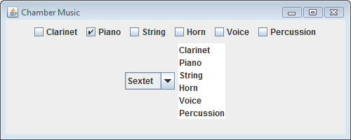
The JComboBox class creates a dropdown list. Its constructor takes the name of a String array as its argument. Each element in the array provides an item for selection in the dropdown list.
Another way of choosing items is provided by the JList class that creates a fixed-size list and its constructor takes an array as its argument.
import javax.swing.*;

class Radios extends JFrame
{
	JPanel panel = new JPanel();

	JRadioButton radio1 = new JRadioButton( "Java", true ) ;
	JRadioButton radio2 = new JRadioButton( "C++" ) ;
	JRadioButton radio3 = new JRadioButton( "Common Lisp" ) ;

	ButtonGroup wines = new ButtonGroup() ;

	public Radios()
	{
		super( "Radio Buttons" );
		setSize( 300,80 );
		setDefaultCloseOperation( EXIT_ON_CLOSE );
		add(panel);

		wines.add( radio1 ) ;
		wines.add( radio2 ) ;
		wines.add( radio3 ) ;

		panel.add( radio1 ) ;
		panel.add( radio2 ) ;
		panel.add( radio3 ) ;

		setVisible( true );
	}

	public static void main ( String[] args )
	{
		new Radios();
	}
}

import javax.swing.* ;
import java.awt.* ;

class Custom extends JFrame
{
	JPanel panel = new JPanel();

	JLabel label1 = new JLabel( "Custom Background" ) ;
	JLabel label2 = new JLabel( "Custom Foreground" ) ;
	JLabel label3 = new JLabel( "Custom Font" ) ;

	Color customColor2 = new Color( 0, 0, 255 ) ;
	Color customColor3 = new Color( 255, 255, 255 ) ;
	Font customFont2 = new Font("Cursive", Font.ITALIC, 32 );
	Font customFont3 = new Font("Gothic", Font.PLAIN, 48 );

	public Custom()
	{
		super( "Custom Drawing" );
		setSize( 400,200 );
		setDefaultCloseOperation( EXIT_ON_CLOSE );
		add(panel);

		label1.setOpaque( true ) ;
		label1.setBackground( Color.YELLOW ) ;

		label2.setForeground( customColor2 ) ;
		label2.setFont( customFont2 ) ;

		label3.setOpaque( true ) ;
		label3.setBackground( Color.RED ) ;
		label3.setForeground( customColor3 ) ;
		label3.setFont( customFont3 ) ;


		panel.add(label1);
		panel.add(label2);
		panel.add(label3);

		setVisible( true );
	}


	public static void main( String[] args )
	{
		Custom gui = new Custom() ;
	}
}
| BorderLayout | Every content pane is initialized to use a BorderLayout. (the content pane is the main container in all frames, applets, and dialogs.) A BorderLayout places components in up to five areas: top, bottom, left, right, and center. All extra space is placed in the center area. Tool bars that are created using JToolBar must be created within a BorderLayout. container, if you want to be able to drag and drop the bars away from their starting positions. |
| BoxLayout | The BoxLayout class puts components in a single row or column. It respects the components' requested maximum sizes and also lets you align components. |
| CardLayout | The CardLayout class lets us implement an area that contains different components at different times. A CardLayout is often controlled by a combo box, with the state of the combo box determining which panel (group of components) the CardLayout displays. An alternative to using CardLayout is using a tabbed pane, which provides similar functionality but with a pre-defined GUI. |
| FlowLayout | FlowLayout is the default layout manager for every JPanel. It simply lays out components in a single row, starting a new row if its container is not sufficiently wide. Both. |
| GridBagLayout | GridBagLayout is a sophisticated, flexible layout manager. It aligns components by placing them within a grid of cells, allowing components to span more than one cell. The rows in the grid can have different heights, and grid columns can have different widths. |
| GroupLayout | GroupLayout is a layout manager that was developed for use by GUI builder tools, but it can also be used manually. GroupLayout works with the horizontal and vertical layouts separately. The layout is defined for each dimension independently. Consequently, however, each component needs to be defined twice in the layout. The Find window shown above is an example of a GroupLayout . |
| SpringLayout | SpringLayout is a flexible layout manager designed for use by GUI builders. It lets you specify precise relationships between the edges of components under its control. For example, you might define that the left edge of one component is a certain distance (which can be dynamically calculated) from the right edge of a second component. SpringLayout lays out the children of its associated container according to a set of constraints. |
import javax.swing.* ;
import java.awt.*;

class Layout extends JFrame
{
	Container contentPane = getContentPane();

	JPanel panel = new JPanel();
	JPanel grid = new JPanel(new GridLayout(3,2));
	JPanel border = new JPanel(new BorderLayout());

	public Layout()
	{
		super( "Layout Manager" );
		setSize( 500,200 );
		setDefaultCloseOperation( EXIT_ON_CLOSE );

    	panel.add(new JButton("PanelButton1") );
    	panel.add(new JButton("PanelButton2") );
    	panel.add(new JButton("PanelButton3") );

    	grid.add(new JButton("A"));
    	grid.add(new JButton("B"));
    	grid.add(new JButton("C"));
    	grid.add(new JButton("D"));
    	grid.add(new JButton("E"));
    	grid.add(new JButton("F"));

    	border.add(new JButton("BorderButtonSouth"));

    	contentPane.add("North", panel );
    	contentPane.add("Center", grid );
    	contentPane.add("West",new JButton("West"));
    	contentPane.add("East",new JButton("East"));
    	contentPane.add("South",border);

		setVisible( true );
	}

	public static void main( String[] args )
	{
		new Layout() ;
	}
}
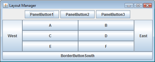
The top level JFrame object has a content pane container which places components using the BorderLayout by default. We can put up to five JPanel containers, which may each use their default FlowLayout manager, or other layout manager listed in the table above.
The content pane can be represented by a java.awt.Container object, whose add() method can specify the position and name of a component to be placed within the content pane.
Ph.D. / Golden Gate Ave, San Francisco / Seoul National Univ / Carnegie Mellon / UC Berkeley / DevOps / Deep Learning / Visualization